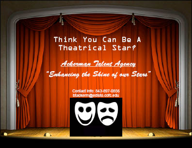
My advertisement is displaying a talent agency for actors pursuing a job in theater. I wanted the advertisement to display one single theme: theater. For the background, I used a picture of a stage. And at the bottom of the stage is a picture of theatrical masks. The original picture of the theatrical masks had the word "Theatre" right below it, so I put a black rectangle box over the word to prevent it from appearing. As for the text in the picture, I used OCR A Std font for the top sentence to give an ancient roman feel to it. I wanted to give the reader a sense of a historical presence when they see that font. For the name and slogan, I used Zapfino font to give off a fancy, upper-class vibe when someone reads it. The focus of this advertisement is to appeal to only actors and actresses who want to pursue a career in theater. I did not want to use any other image or message that gave a different meaning other than that.
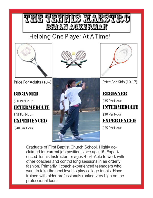
For the business flyer, I decided to advertise tennis coaching for all ages. Because I wanted to appeal to all ages and genders, I needed to create a flyer that appeals to a broad audience. In order to attract kids and adolescences into my business, I needed to attract their parents. I chose the Rosewood Std font for my header because it will get the parent's attention as something that is cool for their kids to learn. At the same time, the actual title "The Tennis Maestro" was created to gather the attention of the older audience. I wanted the title say: "I am great at what I do, so give a call and I can make you great too." With the title being extravagant, I wanted my slogan to be short, straight, and to the point. I used the Thonburi font for my slogan "Helping one player at a time" to let them know I mean business. As far as graphics go, I wanted the main focus to be the picture of me in the middle. I believe it is important for the audience to see the person advertising actually doing what they advertise. I put three tennis rackets above my picture to add a little more creativity to the flyer. Last but not least, I put why I am qualified at the bottom for the audience to get a taste of why they should pick me.
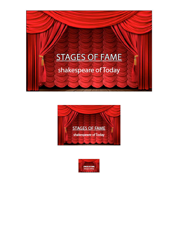
I believe the key in creating a successful business logo is that less is more. I believe there are three keys in creating a good logo. The first key is to have a simple image that corresponds fully with your business. I used a picture of a stage to fill that need. The second key is a simple title and design. For the title I used Handwriting - Dakota font because it is easy to read at first glance and the font catches the eyes of the audience. The last key, if needed, is a short catch phrase that goes along with your company. I placed the catch "Shakespeare of Today" below the title with the same font. As for decreasing the width of the logo, I selected all parts of the image. Then I right clicked and choose transform. Then I selected scale and adjust each picture on the Y-axis to equal the different width.

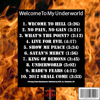
For the CD cover, I wanted the overall theme to be very dark, ominous, and evil. So I thought the perfect picture for the front cover should a picture of the Devil taking up all the space. Although some CD covers have more than one graphic, I felt that a picture of the Devil is enough to get across the theme alone. For the title and artist name, I put flames in the background and used white, Marker Felt text so it would be easier to read. The Marker Felt text has a jagged outline on the letters, which enhances the evil look I wanted to display. For the black cover, I used flames as the background again. I put created a black rectangle box, and put it in the middle. Within the black box, I listed the name of the songs using white, Stencil Std font. I liked the old-school, biblical look it has to go along with the theme. For the record label at the very bottom, I used a picture of the Devil again to appeal to my audience. Using the graphics that I used, I am aware that I am only attracting a certain audience for this CD. So chances are, if you do not like anything evil, this would be a turn-off.